How to Make a Glassy Looking Font
An in-depth look at photoshop's most abused filter, bevel and emboss.
created on 04.04.2004 - updated 16.04.2004: added tips and more sample images
05.07.2005: removed all tables from layout
Introduction
Hi, I'm back, I've still got more in my photoshop goodie bag. This time, we put attention on one of the most abused photoshop filters of all time, bevel & emboss. We'll focus on making use of the effect in a different fashion to get a glass effect out of it. There are similar tutorials like this, but we'll go more into detail to teach you what is going on. You'll need Photoshop 7 or higher.
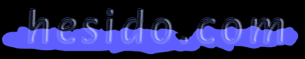
This is the resulting image of my tutorial:
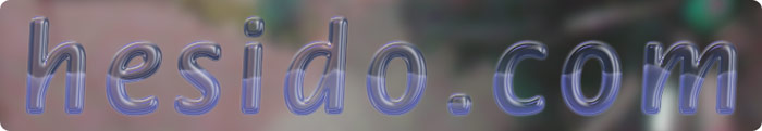
I just happened to add some water for an extra twist. The only bad thing is it doesn't look exactly like water, but you'll just have to ignore that part :)
The tutorial
Beginning
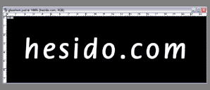
Now let's start by opening a new document, and type something in with a roundy and bold font, color is not important, we won't be using it. My image is 900x300 at 100 pixel/inch, and the type size is 90 points. Try to keep about the same sizes with me, as the values in the effects tab are not resolution based, but they work in pixels. This way you'll run into less problems while learning from the tutorial. Round and bold fonts will have more predictable results with the way we'll use bevel and emboss.
Setting the basics
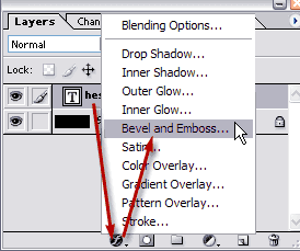
Once you find a font to your liking, add a effects layer to our fonts layer.
Now set the bevel parameters accordingly. Change to , uncheck which would normally help you keep and modify all effect lighting settings of your documents, but this time we won't be needing it as our settings should not later be accidentally changed due to changing other effect settings in future, turn the and to normal. I set the colors like in the picture, you may opt for different hues ofcourse. and settings play a vital role and this time I'll keep them at the default values to show you how works. These and other settings will be discussed later.
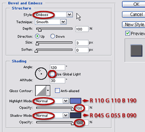
We changed the and to because we'll later use their color straight over the background without combining the color using (underneath colors gets lighter with lighter colors on top) and (underneath colors gets darker with darker colors on top).
The mode puts the bevel and emboss effect both inside and outside the source layer, that is our font layer in this example. So it is like and combined.
The following part in the yellow box is an Hesidoic(!) explanation to how the contour editor works, you don't need to follow it to complete the tutorial. Just skip the yellow box if you already know how it works or don't have the time.
To learn about how the works, we'll first have to double-click the to open it up. Contour editor is the heart of our effect.
The middle of the line tells what color the middle parts of the layer with the effects will be, and at input:50 and output:50 which is the default, it will create a see-through part in our effect (this part is neither shadowed nor highlighted). Now you'll see white because our font is white. The left side of the line defines the color of the shadowed parts (away from light source), and the right side of the line defines the color of the highlighted parts (close to light source). I chose these colors for you to think more mathematically than literally.
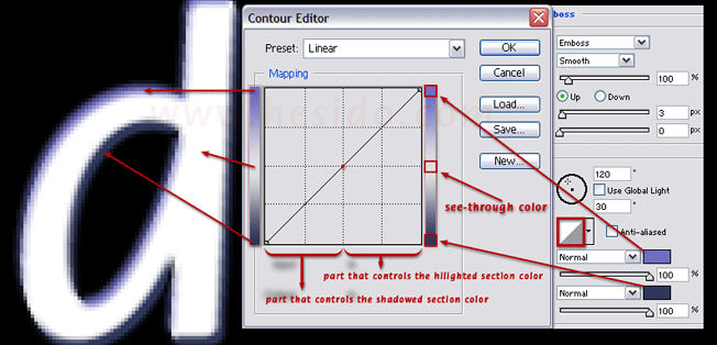
Now to see how this comes down to play, add a control point by clicking right in the middle, and shift it to right a little:
Now we see 2 main changes:
a) The middle of the curve vertically shifted down. The horizontal middle of the graph represents the middle (neither highlighted, nor shadowed) region of the layer. It used to be the see-through color but now it picks up some color from the shadow color we set.
b) The middle of the curve horizontally shifted right, so the see-through color (which was white, our font's color) ran into the "highlighted section", now we see it along with the highlight blur color we set earlier.
The colors which I chose to show you may look inappropriate, but that's to make you think and learn!
Now you may cancel any changes you have made, and go back to the normal tutorial.
Experimenting
Now that we have set the basics, it is time to experiment! We will not need the visibility of the font layer, so we'll simply reduce the layer's value to "0".
You see the visibility of the layer is gone, but the effects visibility that is tied to the layer is there to stay. This is what "fill" does if you were wondering!
Now we'll set the basis of our effect:
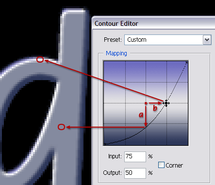
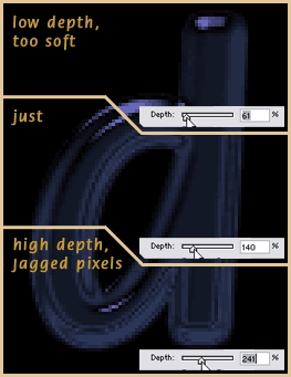
Increase the to about 140% so we'll have sharper lighting, and adjust the size so that the effect looks bold, yet we should still have that see-through (the see-through is black simply because we turned off the visibility of the font layer). Here in this example and in a font about this big (90 points in 100 pixels per inch), I upped the size to 8 pixels. Double click the box to open up the editor, and make your curve look about like this:
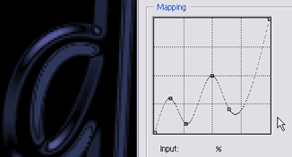
Hmm, now we're getting somewhere. The left half of the curve represents the shadowed parts, and the right half represents the highlighted parts (with respect to the lighting angle). Points close to bottom will yield the color we set for the shadow mode, points close to horizontal middle will yield the see-through color (which is black) and points close to top will yield the color we set for the highlight mode. I kept the middle of the curve at 50 input, 50 output. You may want to check the explanations in the yellow box if you don't understand how this curve creates such an effect. Do not mind the jagged pixels, we may have to deal with them after we play with the lighting angle, which changes the effect to a great extent. Now, go wild with the lighting angle, try everything and choose something that pleases your eye.
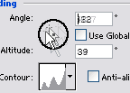
I've already tried lots, and decided this is good for the look I want:
At this altitude settings (with the light almost close to being at the top (when altitude is 90, the light is looking at the layer from the top), the emboss style for bevel and emboss creates two levels of emboss, at the price of one :) I'll choose this kind of look for the glassy feel, you may go for other lighting angles with different depth and size settings.
At this altitude Below shows the effect of different settings.
We adjusted the depth to our liking (140%), let's see how our font is doing:

Increasing Readability
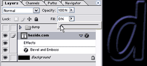
Looking like glass already. The readibility is a bit low tho, we'll add an extra white bevel and a tiny outer glow to fix that, and enhance the glass look later. To do a second bevel to the same layer and to put some water inside, we'll have to create layers from our effect:
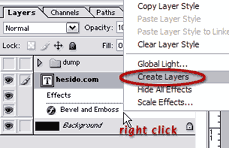
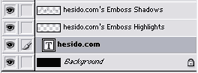
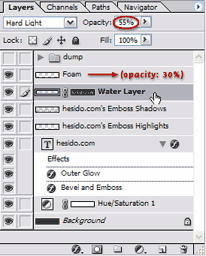
Your layers tab should be looking like in the below, now it has 2 extra and seperate layers that creates the bevel emboss effect (Both of them should have 100% opacity and fill if you have kept my the tutorial, if not, pump them up to 100%. Our original layer with the font should keep its 0% fill.
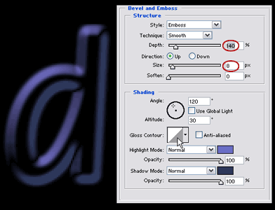
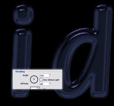
Now, to the font layer, we'll add another bevel and emboss with the following settings (Therefore we'll be using effectively 2 bevel and emboss effects on one layer, but ofcourse the previous one will be fixed, as it is rendered to a layer).
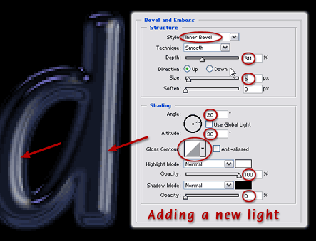
The arrows show the new light's direction. It's direction differs from the first, it will act as a key light. Use white color for this. Reminding you yet again that the pixel based settings may vary in different sized images.
Now it is time to put some water in the font, as if we needed it! But hesido.com always cares about teaching new techniques, so here we go!
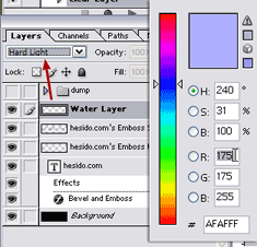
We'll add a new layer to the very top and change its setting to . We'll then pick a bluish and light color.
Filling it with some water
We'll paint over the font in our new water layer with 100% opacity and with a hard brush. We can add some waves to it like seen below:
We'll now have to mask our water layer so it matches the text. We could use our original font layer's transperancy for masking, but this really hurts the effect. Instead we will use the bevel and emboss shadows layer for the layer mask. With this mask, our water layer mask will have semi-transparent values that match the glass effect.
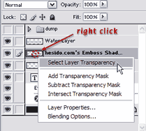
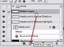
We'll now have to mask our water layer so it matches the text. We could use our original font layer's transparency for masking, but this really hurts the effect. Instead we will use the previously created bevel and emboss shadows layer for the layer mask. Select the water layer and apply the selection as mask.
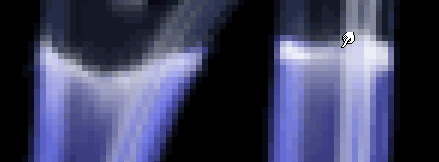
After applying the Emboss Shadows layer's transperancy as the layer mask, you get this:

If we hadn't used the shadows layers transperancy, the water layer would reduce the glass effect. Now it is masked with the transparent pixels of the shadows layer.
Now we'll add some foam. Add a new layer, select a white and hard brush, keep the countours of the water and then smear the foam.
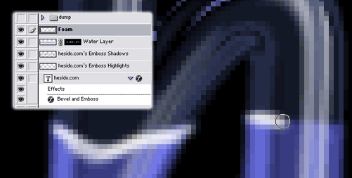
After smearing:
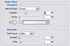
Just do it across the whole text, and you're done with the foam! To increase the readibility, we may just add a small glow to the font layer, and reduce the opacity of the water and foam layer to about 40-50%. The glow settings are as follows (optional):
The Layer Structure, the end result
This is the final layer structure:
Voila! This is the end, end here we have our font in all its glassy glory!!

Variations, final words
Without changing any layer setting, let's add a new background to see how our effect gets along with a different background (a blurred photo in this example) :
I just happened to add some water for an extra twist. The only bad thing is it doesn't look exactly like water, but you'll just have to ignore that part :)
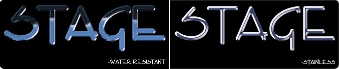
Here are two scaled down images for projection display, I prepared them for a bar called "Stage" some years ago (the bar is now closed to my knowledge, and I hope I am not related somehow to that :) ). The one on the left is prepared like in this tutorial and the one on the right has a single bevel with the appropriate colors and some wavy mapping setting to make it look like steel, or at least, I hope! The font was chosen by them earlier.
Feel free to email me comments and critiques and even some fresh ideas :)