How To Make a 3d Looking flag Using Photoshop
A Really Fast Way To Light And Distort Images Accurately
created on 19.02.2004, updated-05.07.2005: -Added a tip
Removed tables for layout on 05.07.2005
Introduction
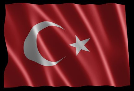
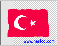
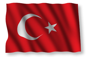
If you've already read my other tutorial you should be familiar with my workspace. You may want to work with your own flag, but just in case you can't find your way in google for a high-res flag, or too lazy to prepare one in eps format that opens up at any resolution (which I had to do in this case), you can grab the Turkish flag we'll be using for this tutorial here. Result of the tutorial:
The technique, revealed
Starting up
Here we go:
We'll start right away by opening our flat flag image first and then convert it to a layer from a background layer by double clicking.
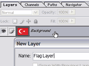
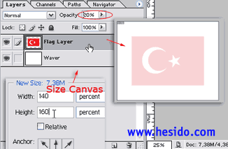
We'll then open up some free space by increasing canvas size. After sizing the canvas, as you see in image blow, we'll add a new layer beneath, we'll call it "waver" or anything that passes by our mind. We'll then reduce the opacity of the flag layer so that we can draw the "waves" better.
Painting the displacement waves
Now, we'll select waver and start painting black on it with such a soft and big brush that makes you want to put your head and sleep on. Try to imrovise, always feel free to try anything. You can also try using clouds here for the waver, I know of some people who can make a Mona Lisa painting with a few clouds and levels combinations. I am not one of them so I have to paint that layer, which is easy anyway.
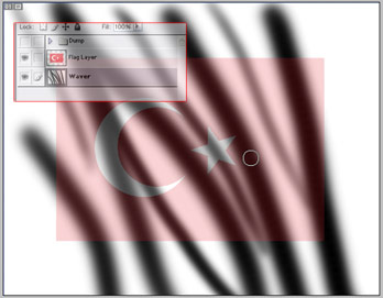
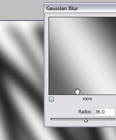
To avoid islands of extreme whites and blacks, we'll apply a very heavy , until we see white and blacks merge to form gradients of gray tones. The numbers you see in the example images are not obligatory and varies heavily according to the resolution of the image we are working, you are not advised to apply a 30 radius gaussian on a 100x100 image!
After we're content with what we have, we'll copy this "waver" layer entirely ( , and then ) and then paste it in a completely new document ( , and then ). We can name the new document as "Flag Displacer".
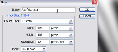
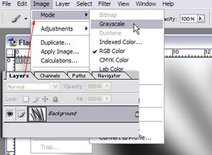
In this new document, we'll first image , and then . This grayscale image will act as our displacement map. . Here you see the image flattened and on its way to being an "officially" grayscale image.
We'll save it somewhere as "Flag Displacer.psd". You can close this document now, we do not need it open.
Emboss for lighting the waves
Now, here is where the magic is coming from: Emboss. Duplicate your waver layer just in case we may have to go back to it, and then apply a strong .
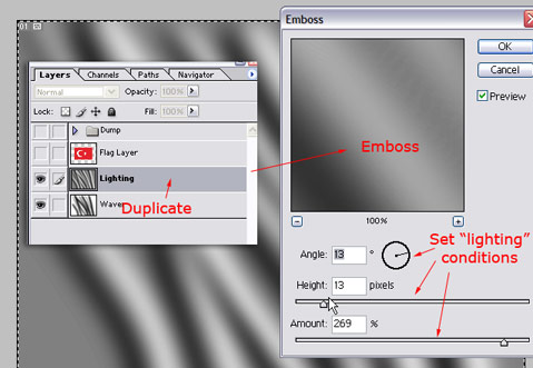
We'll cast "light" on this duplicated waver layer with emboss. Just experience with the emboss settings, try to keep the lighting smooth, but at any time later, we can blur it if need to, it's not a bad thing to try crazy things.
Now we'll go back to the flag layer, and apply the displacement .
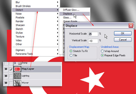
You can see the settings I used in this example, just try different settings according to your personal taste. When we press ok, there'll be file requester asking us for a displacement map. We'll find and select the "Flag Displacer.psd", and voila, the displacement is done. You can undo and reapply a few times to test settings. Here is the displaced layer on its own:
Displacing the base image
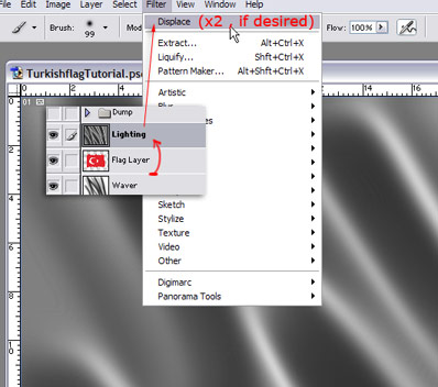
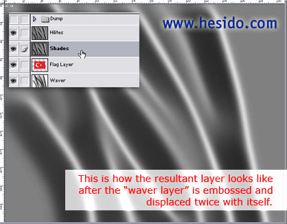
Now, if you overlay the embossed lighting layer on top, you'll see what we're going for. But you'll also notice that the embossed layer is not aligned well with the waves of the flag, esp. if you have done quite a lot of displacement, this will be more evident. We'll easily fix that by displacing the embossed lighting layer with the exact same settings as the flag. If you have not used any other filters after last time we did in this tutorial, you'll find our beloved displace filter right under . Place out embossed lighting layer on top, and then apply the filter. Once is enough to align the lighting layers pixels perfectly with the creases of our flag. But we can displace it twice, which will condense the lighting a bit and give a stronger result. Don't worry, displacing twice does not pull our pixels all in the wrong places, as we are applying the same displacement, we are making it stronger. (It is not the same thing as doubling the displacement values!)
Playing with the levels of the lighting layers
Now we have all the necessary pixels in our hands to simulate the 3d look, we can use them for any color and level combination. The rest of the tutorial is based on personal tastes, the technique is already revealed.
We'll duplicate the lighting layer, I renamed them, as they will do exactly what their names suggest.
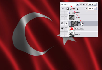
You see our lighting layer already looks really cool :=) If you like it, you can leave it that way, but our flag needs some lighting, so we'll go back to work. We'll group () the shades to the flag layer and select . We can play with the opacity of the multiply layer. Voila! It already is a nice looking flag, at least to me ;), so you can just leave it as it is, maybe apply brightness or adust gamma to the whole image to get highlights and brightness. But we don't stop there, I'll try to show you how to add some highlights using the the duplicated layer we named "hilites". Multiply does not make parts brighter, and we want total control over the highlights, so we'll simply go on!
We'll make the "hilites" layer visible, and change its layer type to . Do not group it to the flag just yet. Oh no, all our shades washed out! We'll get that right ASAP with a levels layer grouped to the "hilites" layer. A can be opened by pressing on the menu at the bottom of the . Adjust the input levels so our shades take a sigh of relief, and only highlights are revealed. You can also adjust how strong the highlights are by adjusting output values or the opacity of the "hilites" layer.
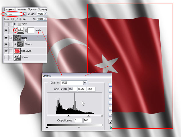
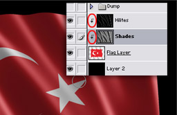
Ok, you see above that we managed to do what we promised for. As the layers are not grouped, the image looks like a flag painted on a bigger piece of wavy substance, which maybe even cooler than a flag waving on its own :) Here, in the ungrouped view, we can also check if our lighting layer matches with the waves of our flag. But to conclude the tutorial, we'll merge down the levels adjustment layer to the "hilites" layer so we can group it to the flag layer. Note: First merge the levels layer down and then group, or else the adjustment layer will simply adjust the wrong layers! We'll also throw in a black and dull background. In the image below, you see the "hilites" layer is merged with the asjustment layer, this explaing why it is no longer there :=)
Here is the result:
Variations
Below is a variation I made in mere minutes using single displace (twice is for the satin look, I must say), and a single multiply layer for shading (no screen layer), the light direction is different. The multiply layer had to be adjusted with a levels layer. This looks more like an ordinary flag, without the satin look. Keep in mind, I displaced once instead of twice, so the the gradient is smoother. This is also to show you the importance of experimenting with the tutorial instead of doing everything verbatim :)
Final words
I hope that you found this tutorial useful. Feel free to email me comments and critiques and even some fresh ideas :)
Back To Home For More Tutorials